
These kit articles have been going down a treat, it seems there are more than a few of you out there with a real penchant for classic kits of all description.
Today, Clark Edison and Adam Barlow are in the hot seat, whilst tomorrow one of Classic Football Shirt’s employees and long-time friend of the blog, Tom Williams has put his collection together, which might come as a double-header with my own choices. I say ‘might’ because, despite the virus fears, I’m having a summerhouse delivered tomorrow that will eventually house a pool table and much of my Imps’ memorabilia. I might be tied up with getting that sorted, and definitely not playing Championship Manager.
Anyway, on with the show, step up Clark and his inability to count to five….
As far as football shirts go, I’m pretty obsessed. I also have an obsession with 90’s Italian football, as most of us did back in the day I’m sure. Not sure? GOOOOAAAAALLLLLAZZZZZZOOOOOO. Did that bring the nostalgia back? Yeah, thought so. I thought I would show a couple of my favourite 90’s shirts – with a Spanish beauty thrown in the mix – and also some more ‘modern’ classics. I hope you enjoy it!
AC Milan 90-91 Home

The instantly recognisable red and black stripes, the ‘Rossoneri” are a great place to start with a classic design. This shirt came with or without the European Cup stitched under the star as a nod to their triumph over Benfica the year previous, and the missing cup is a slight on my own shirt! Everything about it oozes Italian class, the collar, the sleeves and star-studded defenders that made it so famous – Baresi, Costacurta, Maldini and Rijkaard, quite the team.
Juventus 97-98 Home

The Old Lady of Italy. Notts County Reserves. Zidane, Del Peiro, Davids, Deschamps and Inzaghi all part of a great squad in 97 to wear the famous barcode shirt. Kappa are notorious in making historically great shirts, and this is one of them. The era of silk material, I was lucky in picking up a longsleever a while back (I have a friend in Florence that finds gems) and it’s certainly one of my favourites. Back before when they had a decent club crest, it was situated on the arm to make room for the Italian Scudetto logo. The collar is a beauty and the sponsor is a classic!
Barcelona 95-97 Home
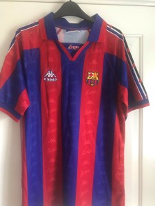
Another Kappa, and the Spanish beauty! Look at the arm logo’s, look at the watermark pattern – how can you not love it. This shirt was probably introduced right at the start of Spanish football becoming popular in this country, a couple of years later and Sky bought the rights to televise it on Saturday and Sunday nights, a fixture in my household. This was also the shirt that the real Ronaldo wore in his short time there. I’m not going to mention that collar again…
Stuttgart 03-04 Home

A simple design is surprisingly easy to get wrong, this is how you do it right. Everything fits well into this, exactly how sponsors should be incorporated into a shirt. I love the sleeve and collar trims, it really screams class as a shirt to me. I think you’re getting the feel of my love for foreign football and the Bundesliga is right up there for me. The club crest is striking too, fitting for German footballing royalty.
Bayern Munich 14-15 Home

A very controversial choice. Bayern fans recently voted that all home shirts will only ever be red and will never feature the blue stripes again. They’ll have their reasons of course, but you can’t deny that this isn’t a beautiful shirt. A homage to the 89-90 special shirt, it just works. I personally love stripes (as a City fan, who doesn’t) so this hit the target straight away, and the colour palette works. Guardiola and Bayern dominated wearing this, and if we’re doing German football, we can’t miss Bayern Munich out can we?
England 99-01 Home

I felt compelled to include my favourite England shirt and it might come as a surprise to some given it came from a pretty poor period in English football history. The last shirt used at Wembley in that famous defeat to Germany with Didi Hamann’s free-kick daisy-cutting in from what seemed like miles. It’s a cracker of a shirt for me though, the traditional England colours, none of that different coloured sleeve nonsense. A great pattern across the front and across the sleeves, Umbro always did great stuff with our national side. Bring them back!
Lincoln City 08-10 Home

Got to include my favourite City shirt of course! I’m going more modern than most would choose. Associated with Peter Jackson’s hope laden era at the club, I remember buying it in the club shop with my Dad and little brother, slinging it on over my jumper in the Co-op stand toilets to my Dad’s dismay and feeling as proud as punch. Fast forward 12 months, I wasn’t feeling so clever anymore. It’s a great shirt though, with clean stripes on both the torso and sleeves, it also had an unusual pattern along the top of the arms. I feel like Umbro always did decent shirts with us, and given their present-day templates a return would be most welcome.
Dont know why we cant have a Lincoln Green colour kit.